Give the spectacle a job
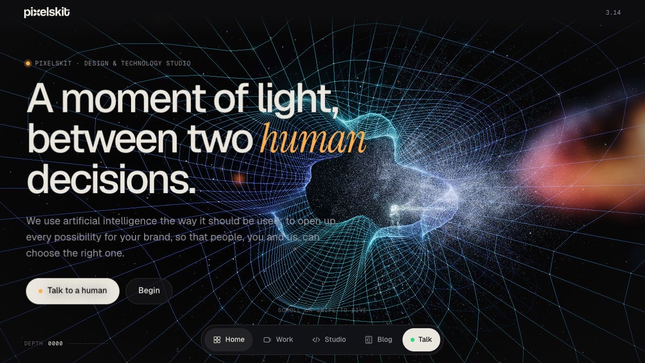
Our website begins with a moment of light and follows a journey through human ideas, machine exploration and human judgement. The moving world is there to make that story tangible. A hand, particles and a prism mean very little if somebody leaves without understanding what the studio does.
That became our main design question: does each visual moment help the visitor understand the next part of the story? When the answer was unclear, the useful change was often a better instruction or a more direct route, rather than another effect.
Design the route as carefully as the scene
A scrolling world does not behave like an ordinary stack of sections. A visitor may need to understand that continuing to scroll will build a scene, or that an Explore button leads to the service cards rather than skipping them. These are navigation decisions, even when they are expressed through motion.
We added explicit destinations for Build, Create and Grow, a Next action after those cards, and clearer guidance around the work and Studio sections. The lesson is practical: when a design changes familiar movement, it must help people learn the new movement without making them study it.
A beautiful asset still needs to arrive
The hand scene depends on data reaching the browser. If that data is late, a correctly built animation can appear broken. We improved the delivery path through smaller device-appropriate assets, compression, caching and preloading, while keeping readable content available when the richer experience cannot initialise.
The important distinction is between having an asset on the server and having it available when the scene needs it. A successful local render is one piece of evidence. Checking a real anonymous load on the public site is another.
Keep the content in a system people can edit
The public experience runs with WordPress content behind it. Services, projects and article content have a home separate from the camera choreography. That lets the design remain distinctive while giving the business practical controls for changing the words, images and selected work.
It also means that a project can have an ordinary shareable address. Somebody receiving a link should land at the right project or section, rather than having to replay the whole introduction to find it. The browser’s Back button is part of that contract.
Make the return trip feel deliberate
The Field notes prototype included a different atmosphere for reading: a calm flat page reached through a line of light. We recovered that passage and connected it to the live articles. The reverse transition returns the reader to the position they left in the immersive site.
That small continuity matters. It makes the article feel like another room in the same place. It also provides a useful test: if the animation is unavailable, can the reader still follow the link and return? Richer motion should improve an understandable route, with ordinary navigation remaining dependable.
The finished website is still something to maintain and learn from. New work, different devices and real visitor questions reveal where the experience can become clearer. The most useful result of building a universe was a sharper appreciation for the simple things that make a website usable.